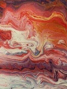
A color story is a collection of specific colors joined together in the expression of the same meaning, illustrating the identical visual statement. It is, in fact, a mood board that utilizes shades, tones, and hues for persuasive purposes, in the building of atmosphere, or in the guidance of how one is supposed to interpret what they have viewed. Color stories are commonly utilized in fields like interior design, fashion, branding, and cinematography because, at times, what color can convey is more important or even more paramount than using words themselves. For instance, the color story for a winter clothing line may feature cool blues, snowy whites, and deep grays, evoking icy elegance and poise. In contrast, spring is replete with true pastels such as pinks, yellows, and mint greens, steeped in a vibrant freshness and youthfulness.
Color in Branding and Marketing
Brands have their own color stories for building their identity and relating to the target. Take better-known brands such as Coca-Cola, Tiffany & Co., or McDonald’s; each one has their own specific color schemes, and these are all such different ideas that come to mind immediately. There is this intense, bold red of Coca-Cola that suggests energy, excitement, and passion. Then the robin-egg blue color of Tiffany’s is associated with luxury, refinement, and exclusivity, whereas bright red and yellow with McDonald’s kind of bring about fun, hunger, and satisfaction.
The colors chosen can represent the values of the brand and its target audience; color stories thus become the strategic play in creating long-term impressions. According to research, within 90 seconds of viewing a product or brand, people subconsciously base up to 90% of their judgments on color alone. The right color story, well-thought out, makes the difference between an easily and deeply memorable brand and one that fades quickly out of focus.
Color has a deep influence on our lives, not just on what we see but also on how we feel, think, and respond. We do not realize how color plays a part in our choices, moods, or even memory banks. Colors have a story and an emotional tone that underlies the message further, something we like to call “color stories.” The designer, artist, and filmmaker all create a feel for these colors to convey certain emotions and tell specific stories. From a warm hue reminding us of the great sunset on a summer’s day to a cool hue reminding us of a misty morning, colors speak much louder than words can manage.
The Psychology of Color Stories
Color psychology is the study of hues as a determinant of human behavior. It analyzes how colors impact emotions and decisions. Warm colors such as red, yellow, and orange are most closely associated with energy, excitement, and positivity. Cool colors such as blue, green, and purple stimulate calmness, relaxation, and peace. However, the interpretation of color varies with cultures. White is attributed to represent purity in western countries and weddings, but to some people with an Eastern culture, white is the color used when a person is mourning and even having a funeral.
Colors say more than expression. They also inform of the intention when used in art. Hospitals, for instance. You see lots of blues and greens there because these colors are associated with rest and a process of getting better. In films, color stories can be carried to represent a journey of a character: warm tones for happy scenes, muted grays during sad moments, and vivid reds in times of being angry or passionately in love.
Color Stories in Cinema
Filmmakers are a kind of color-storyteller, using such palettes to tell the audience how to interpret certain scenes and character arcs. For example, for Wes Anderson, unambiguously colored frames blend into what the curio and even the story itself turn into. These different shades, along with deeper tones that offset them, form a unique world that adds depth and uniqueness to the storytelling.
In horror movies, there are many dark and desaturated colors used throughout the film to create a sense of fear and tension. Romance films may be warmer or softer when the moment is about intimacy or love. Color has become a way to show the internal worlds of characters and the emotional progression of the plot because it helps guide the viewer through the experience.
Creating Personal Color Stories
Color stories don’t apply only to professional use, though. They can be applied to our personal lives as well. A person can decorate a home with a certain palette and feel attuned to their personal style or energy level. A very common example is the use of shades of the same color in order to have a single monochromatic color story. An interesting and energetic color mix can be a mix between orange and teal.
Another place for personal color stories is fashion. Neutral shades of clothing are an adaptation to versatility and sophistication, whereas bolder tones create or equate to an individual’s self-personality. A person may say that the clothes he or she wears influence his or her mood and self-esteem; everything comes down to the color story of self-expression.
Conclusion
Color stories are more than just visual arrangements. They’re narratives speaking to our emotions, perceptions, and decisions. It’s how the colors we use in brands or the world of cinema are all intricately woven into a unique story regarding our lives. Understanding color stories can help us be intentional with our communication, decoration, and presentation through enhancements in how we connect with the world. Be it a soothing color palette in the living room or the colors of our favorite outfit, every color story invites us to live life with an altogether wealthier and more vibrant perspective.